Page not foundPlease use the back button on your browser to return to the previous page. |


Page not foundPlease use the back button on your browser to return to the previous page. |

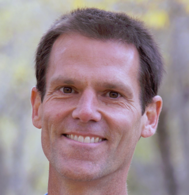
Welcome to a new way of health! I am Dr. Scott Olson ND - Naturopathic Doctor (a doctor who specializes in natural medicine).
I am a strong believer in food and exercise being your best medicines and I hope that this site helps you with your own personal journey towards health.
Start exploring anywhere you like, and make sure to check out: my programs, my books, and other tools to help you live a long, healthy, and enjoyable life!
Dr. Scott


